Tahoe’s macOS 26 review: fresh design and a world without Launchpad
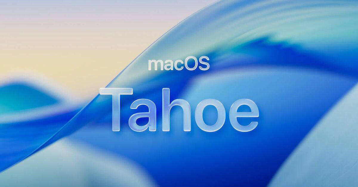
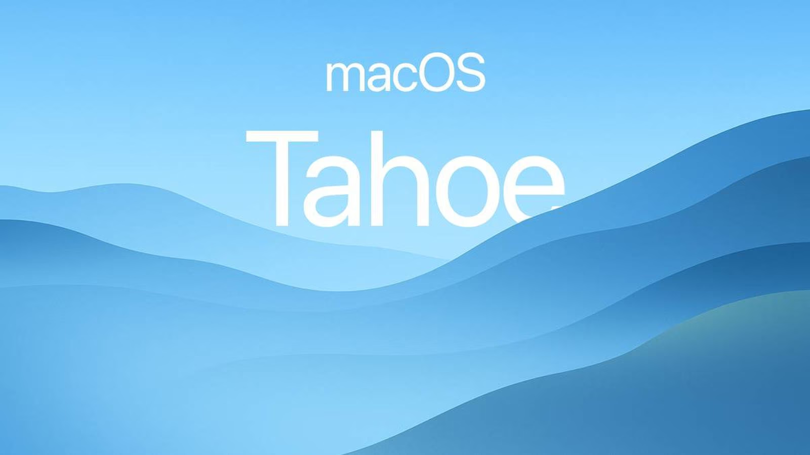
MacOS 26 Tahoe got a pretty major update this year. In addition to the “liquid glass” it concerns the overall design of app icons, as well as their customization. For the most part, they’re small things, but they’re the things that create a new look for this year’s PC operating system.
Welcome
It’s a small thing, but it looks nice. Now, when you turn on your computer or laptop, you are greeted by translucent glass “hello” lettering in different languages. This design looks fresh and interesting on your computer. Also, if you look closely, you will notice that the text in all pop-ups is now left-aligned instead of centered. This is also a minor part of the update, but this alignment is familiar to the eye, and so here we can only be happy that the update is out. And, of course, there are new wallpapers. And whether you like them or not is a matter of taste. But I found them interesting.
New icon and app design

All the shortcuts on macOS 26 Tahoe have changed slightly. Only a few of them are critically changed, but they all share a slight blurred border. It’s as if the shortcuts aren’t fully focused. It gives them a certain softness.
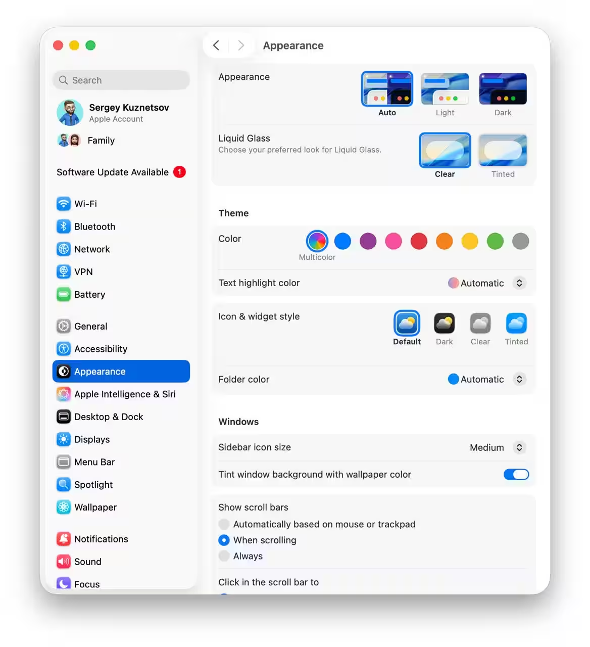
As was also available a couple of updates ago on iOS, you’ll now be able to customize the appearance of shortcuts – a light or dark theme, or highlighting with a particular color. Whatever the case, the customization now looks exactly the same on smartphone, tablet, and computer. You can also choose the “Clear” option for app icons. This is similar to the “Transparent” option on the iPhone and iPad. As on other devices, here they become transparent and lose some of their color uniqueness. Maybe some people will get used to it quickly and like it, but I get lost in the pile of identical icons.
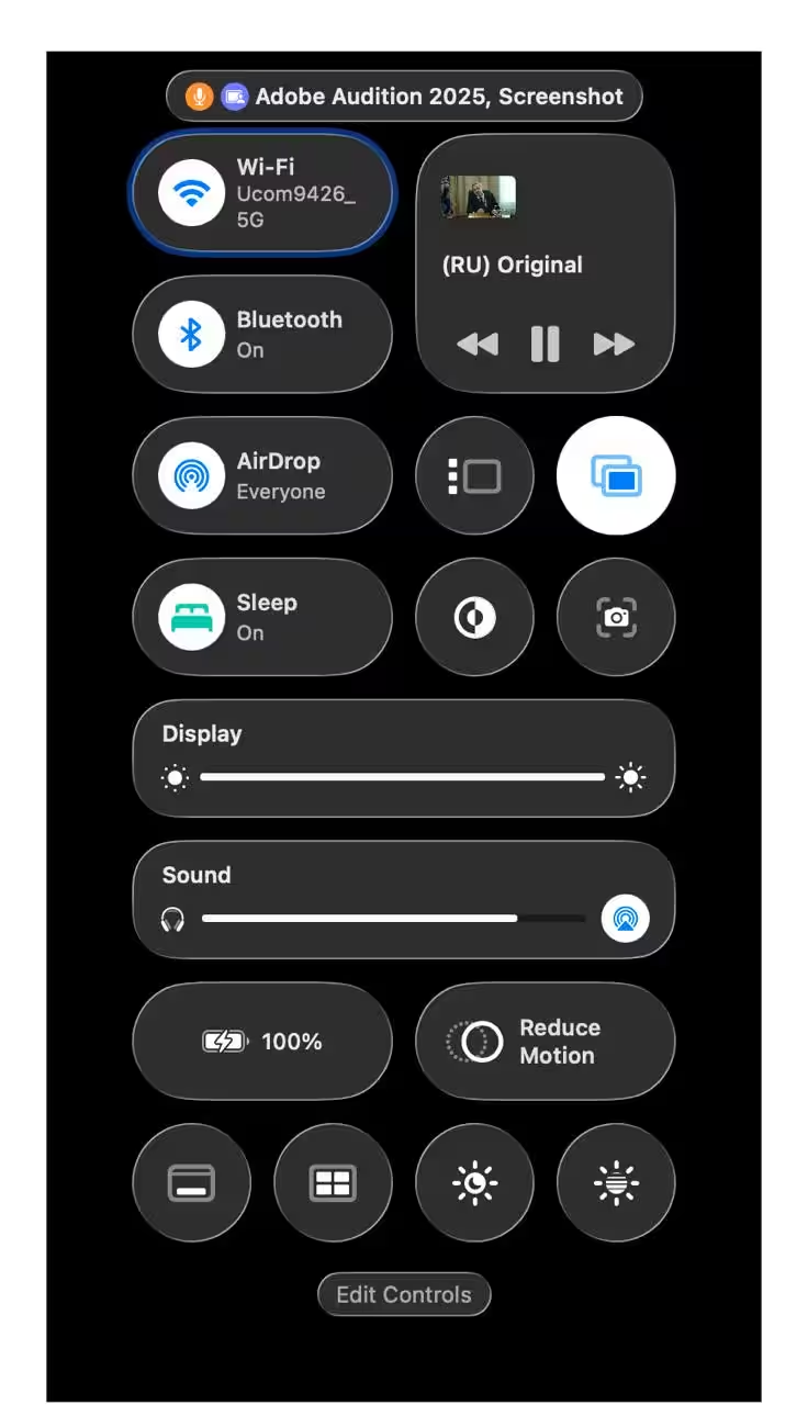
The control center has been fixed a bit too. It looks handy, pretty, and can now be customized.
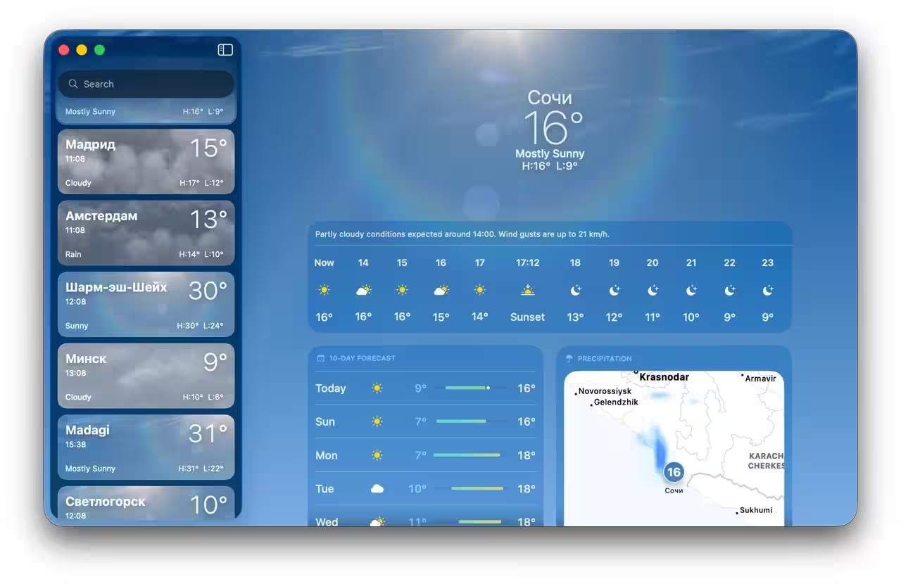
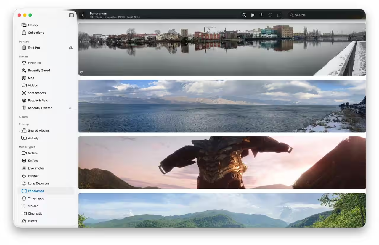
Although “liquid glass” is something that all of OS 26 has in common, there’s still less of it on the Mac. For example, in the Photos app, this update seems to be present, but just a little bit. Not like it is on the iPhone. And maybe that’s even a good thing, and it’s more convenient, and creates some uniqueness to the devices.
Launchpad is everything?
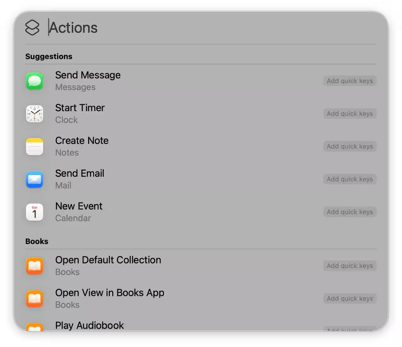
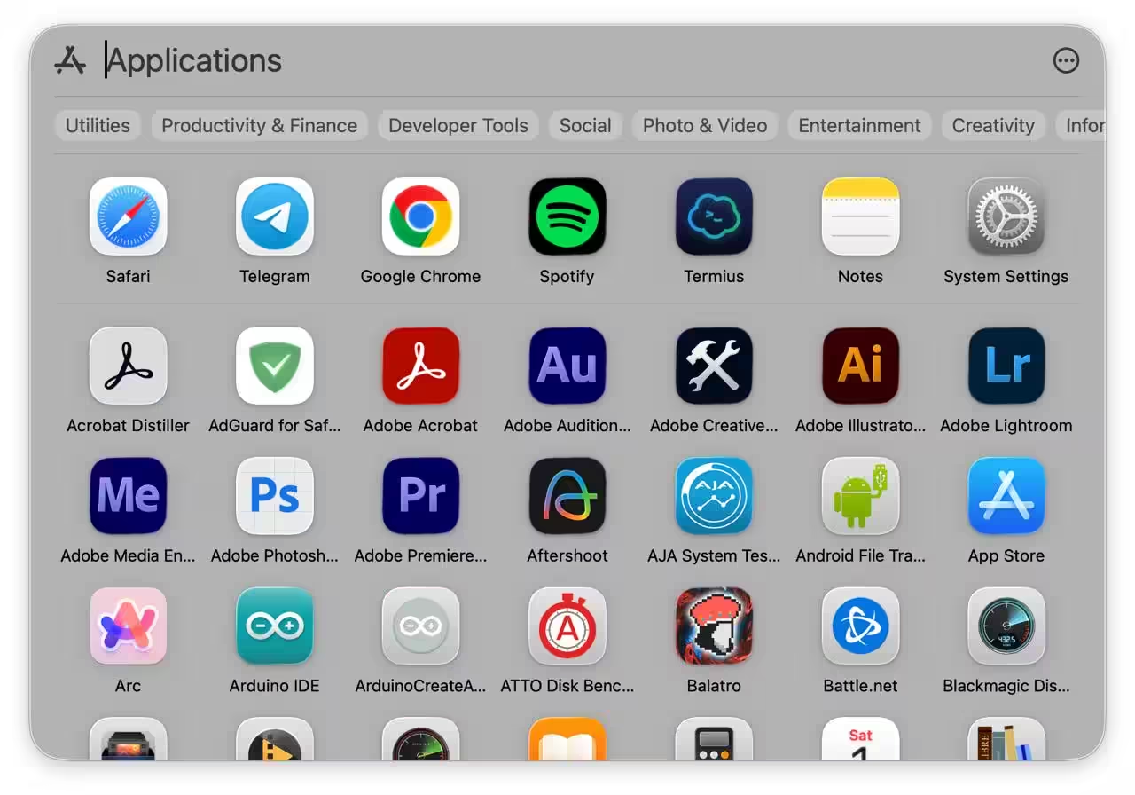
Launchpad was a tool you could use to launch apps in macOS. Over the years, many users have gotten used to it. In the past, you could arrange the app icons however you wanted so you could quickly navigate through them. Now, instead, you’ll see a Spotlight search box open in front of you. On the one hand, some might find this convenient. On the other hand, it can cause some problems, especially if there are a lot of apps and you can’t remember exactly what they’re called.
Of course, you can always use third-party apps that will simulate Launchpad, but it would be more convenient if it was left up to the users.
Other
