YouTube Music’s new design makes it easier to navigate and manage

Google has unveiled a redesigned interface for the Now Playing screen in the YouTube Music app for iOS and Android. Changes have been made to the layout of the controls and added new interaction scripts to make it easier for users to control music and navigation.
What’s changed in the interface
The Song/Video toggle has disappeared from the top of the screen, leaving only the Cast icon and the additional menu button next to it.
The main control buttons – Shuffle, Rewind, Play, Forward, and Repeat – have moved above the progress bar, which is now noticeably thicker.
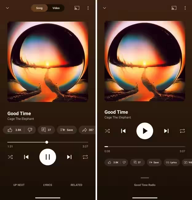
Beneath the progress bar is now a carousel block with buttons for Like/Dislike, Song Text, and Song/Video toggle.
In place of the Next button, there’s now a slider that you can pull up to see a playlist or radio station. A short press opens a two-window view, with Now Playing on top and the next four tracks in the queue below.
How to get the new interface
The update is distributed server-side and appears to users gradually. On Android, you can try to force the inclusion of the new version:
- Go to Settings → Applications.
- Find YouTube Music and open “App Info”.
- Click “Stop Forcefully”, close and reopen the app.
The method doesn’t always work because the interface is selectively enabled.
YouTube Music vs. competitors
- Apple Music offers better sound quality with lossless and spatial audio.
- Spotify is famous for its interface and recommendations, and recently added lossless streaming.
- YouTube Music wins for having the largest library – you can find tracks that its competitors don’t have.

