Google Discover is testing a new Material 3-style card design
Google has begun testing a redesign of the Discover feed using Material 3 elements, which is now available on the left-hand Android screen and in the Google app.
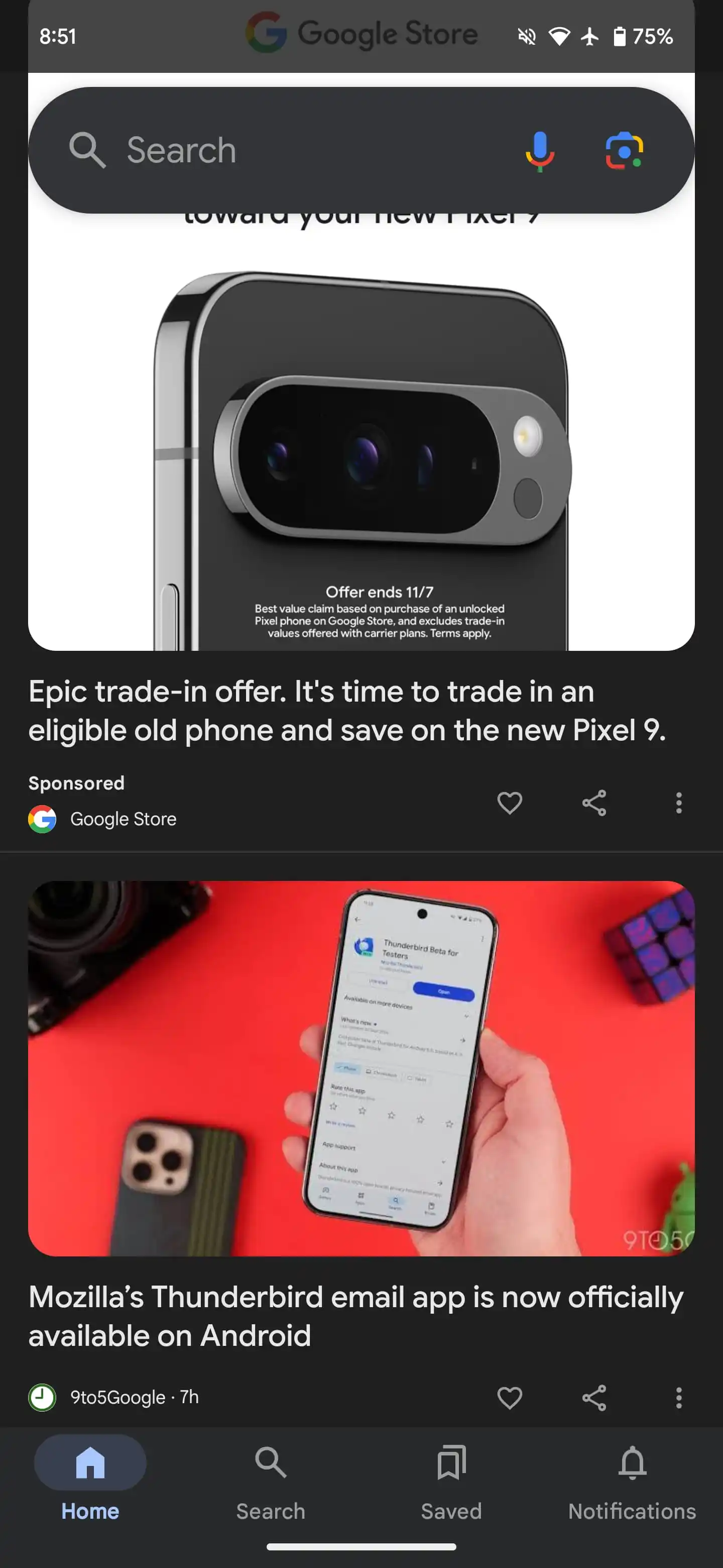
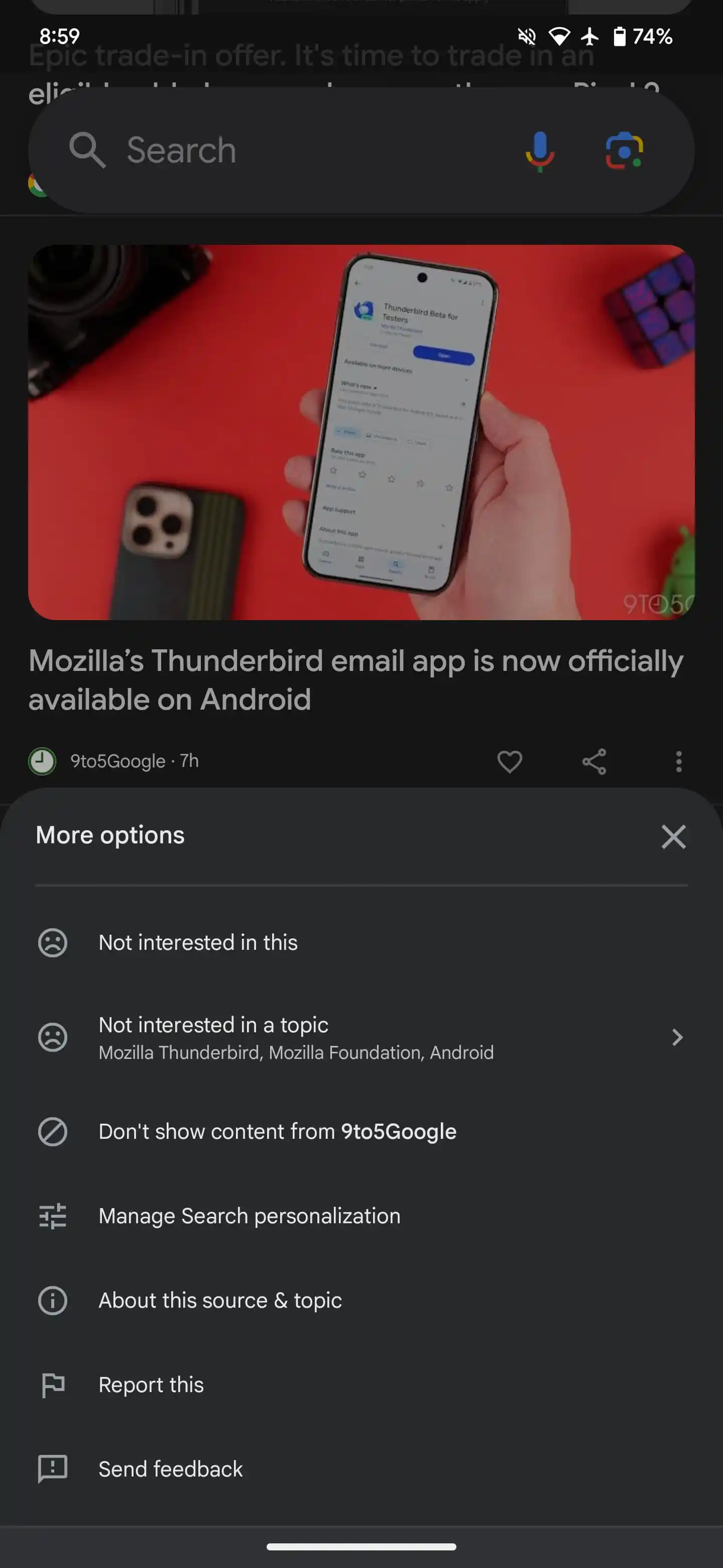
In the current version, the ribbon design features images, text, and buttons placed on a light or dark background, separated only by lines. However, in the updated interface, each item is now designed as a separate card that doesn’t reach the edges of the screen, with taller images and a simplified menu with a single button to trigger additional actions like “Save” and “Share.”
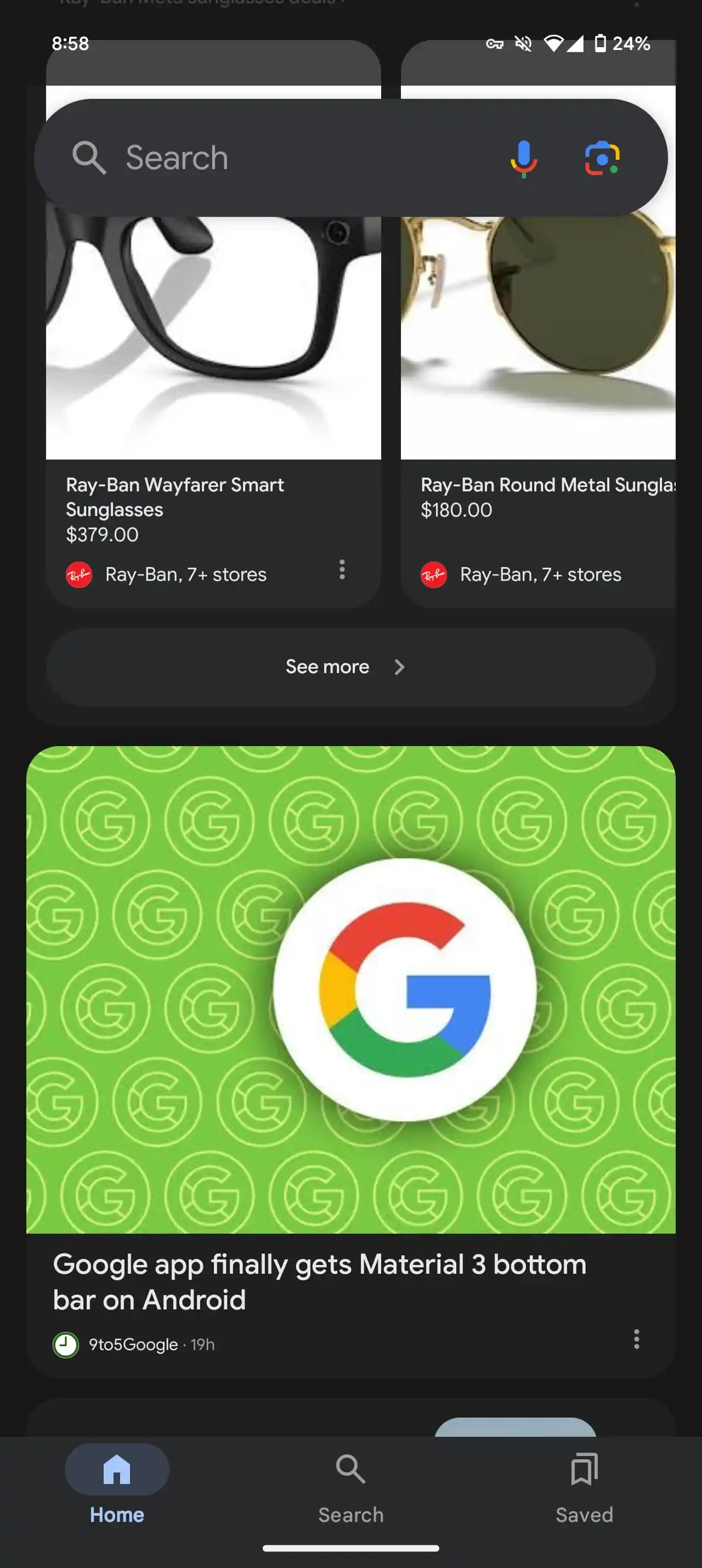
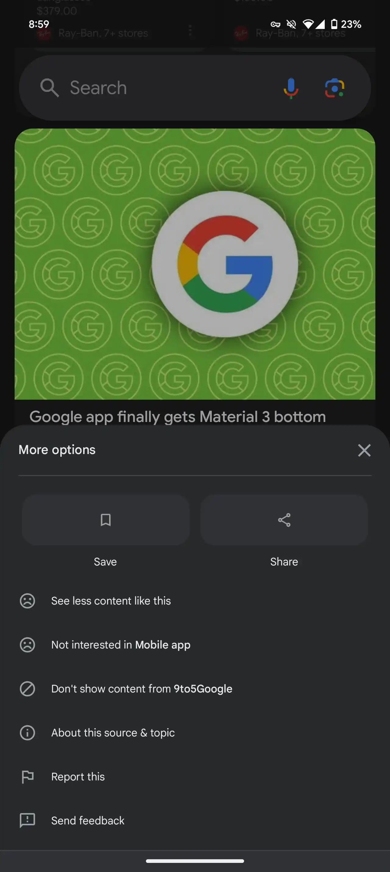
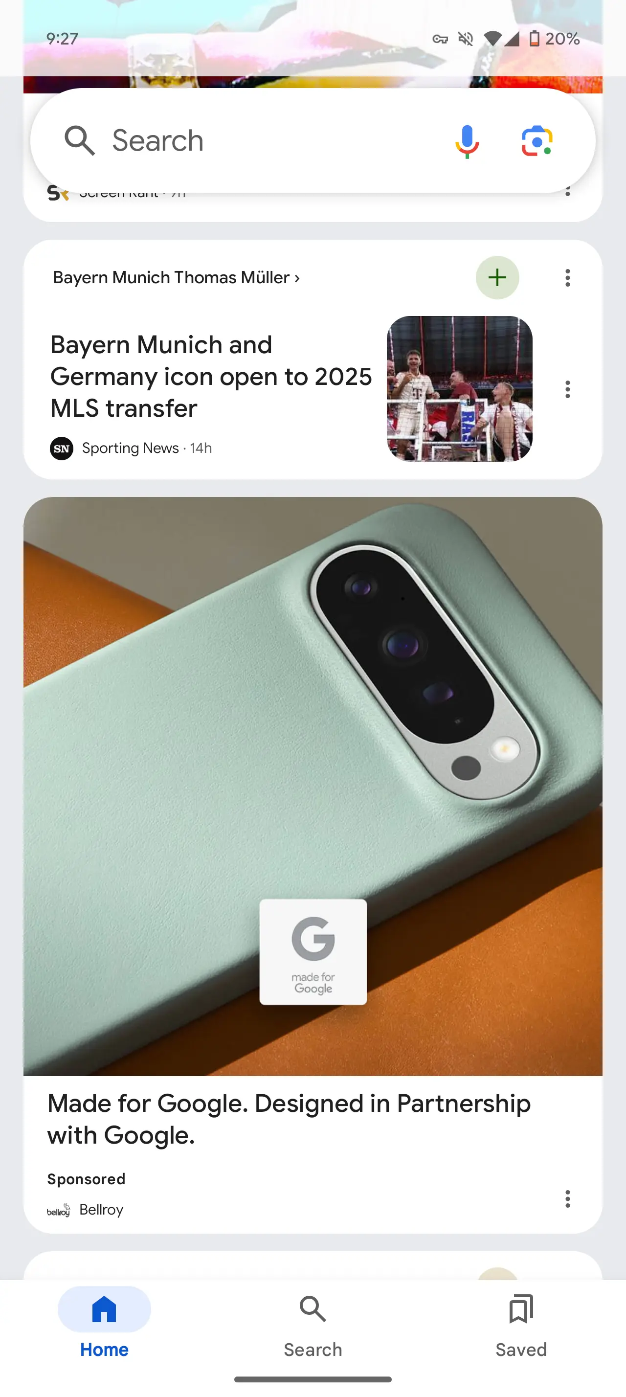
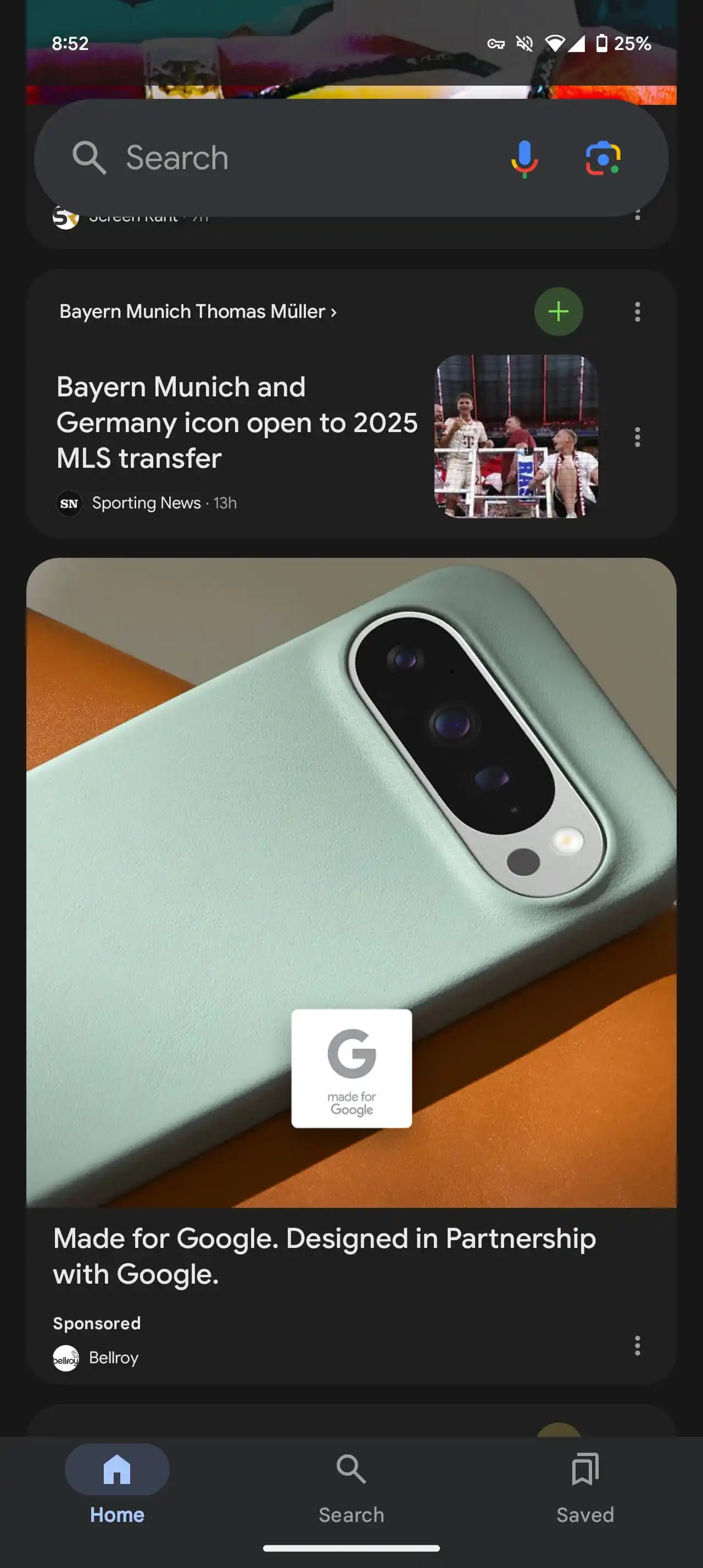
Google has also added a new card type that displays a theme at the top and prompts the user to quickly subscribe with a “plus” button. While some find the new design more in line with Material 3, it’s been criticized for being cluttered and having too many elements. The updates can already be seen in Google’s beta version of the app (15.43).
The updates are already available in the beta version of the app.

