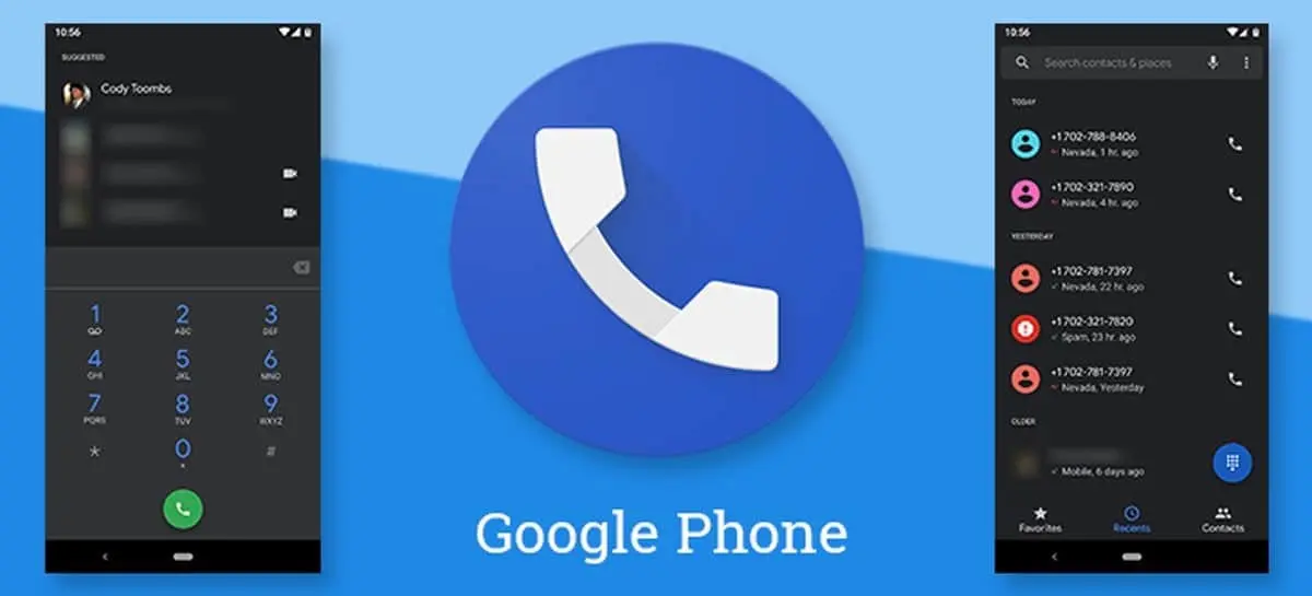
Google Phone: New iPhone-inspired call design
The Google Phone app used by most Android smartphones, including Xiaomi and OnePlus models, may soon get a new incoming call screen design inspired by the iPhone interface. The only exception is Samsung, which still uses its own calling app. Over time, Google continues to improve its caller, adding features like call recording, smart spam blocking, audio emoji, and a redesigned design.
Callers are also expected to get a new incoming call screen inspired by the iPhone’s interface.

The company is testing a new interface for the incoming calls screen that offers a different way to accept and reject calls. While the current version requires you to swipe up on the phone icon to accept a call and down to reject it, Google is now looking at a simpler system similar to the one used on the iPhone.
The company is now testing a new interface for the incoming call screen that offers a different way to accept and reject calls.
New call interface: accept and reject buttons
According to Android Authority, changes have been spotted in the latest version of Google Phone (v145.0.672690850) that could make the process of interacting with the incoming call screen more convenient. Instead of swipes, two separate buttons will be available: a green button to accept a call and a red button to reject it. The accept button is on the right and the reject button is on the left, which is similar to the layout on the iPhone.
Interestingly, on Samsung devices, the button layout is reversed, with the accept button on the left and the reject button on the right.
The new interface is still being tested
.
It’s worth noting that the new calling interface appears to be tested using a server-side switch. This means that even if you have the latest version of the Google Phone app installed, you may not see the changes yet. So, the company is testing user reaction to the new look before releasing it universally.
The company is also testing the new look and feel of the new design.
Simplicity and user-friendliness
The new buttons for accepting and rejecting calls can greatly improve usability, especially for new users. Instead of having to figure out which way to swipe, you can simply tap the right button. This is especially true for those who have previously used a Samsung or iPhone, where the call control is different.
The new buttons can be a big improvement in usability, especially for newer users.
Many users admit that it took them a few seconds to figure out exactly how to reject a call on a Google Phone, which is frustrating, especially if they’ve used devices with a different control system before.
Many users admit they had to spend a few seconds figuring out how to reject a call on Google Phone, which is frustrating, especially if they’ve used devices with a different control system.
Wishes for the future
While Google is working on updating the inbox screen, we can hope that the company will also improve the display of the contact’s photo. A larger image would make the process of recognizing a caller even more convenient and visually pleasing.
A larger image would make the caller recognition process even more convenient and visually pleasing.

