“Yandex” announced the rebranding of “Market” and showed its future design

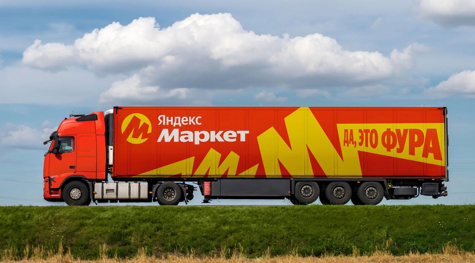
“Yandex Market” has updated its appearance, including the logo and the main page of the site. Now the main colors of the marketplace — a bright combination of red and yellow. One of the main goals of the rebranding is to increase Marketplace’s visibility on city streets. The company has shown how the order pickup points and the service itself will look like.
The company has also shown how it will look like.
The service’s new positioning strategy is based on the principle of changing the market for the customer. For example, Marketa was one of the first among its competitors to launch Click-to-Click Delivery and Split. The company has big plans to expand its fast delivery capabilities and introduce new convenient services that competitors don’t yet have. The brand refresh — is the first step in a series of changes that will take place in the service.
The new branding is the first step in a series of changes that will take place in the service.
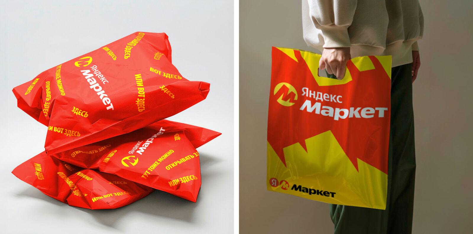
“The e-com market is shaped by a few big players. Here you have to constantly compete for the customer’s attention. Our update helps to solve this very utilitarian problem. The new style combines two colors: red – a reference to the parent brand of Yandex, and yellow – the corporate color of Market. The contrasting combination will help make Market stand out in the eyes of users among other popular sites,” says Andrey Dovzhik, the company’s marketing director.
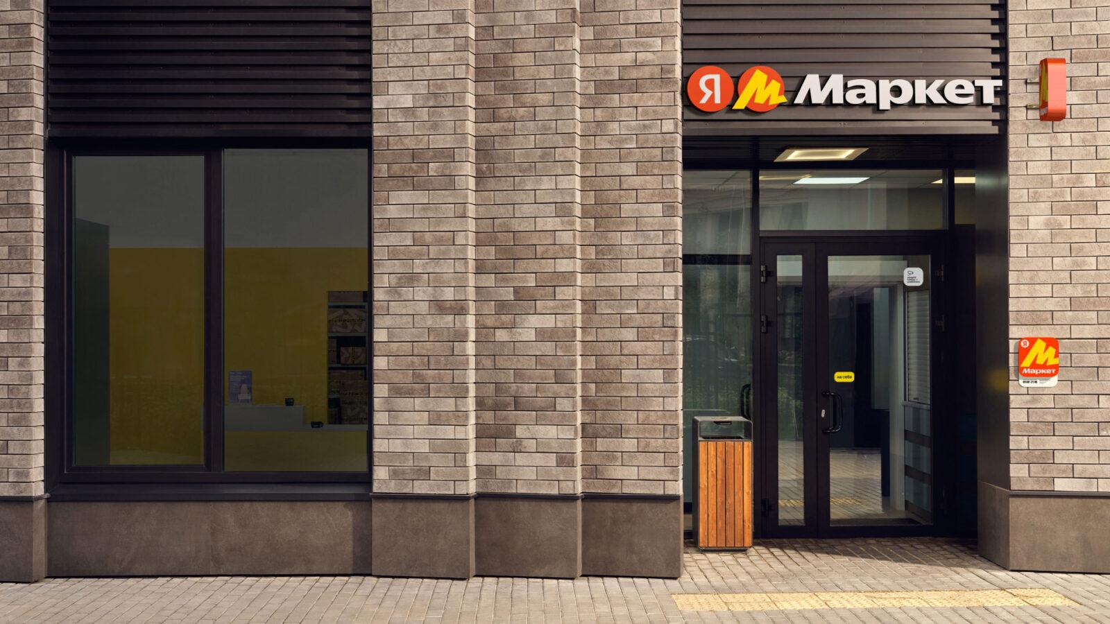
The rebranding will take place in several stages. First, the interface on the website, its mobile version and app will be updated. In April, some of the existing delivery points will also change their design, and all new ones will open in a red-and-yellow style. By the end of 2024, Market plans to complete the renovation of order pickup points, logistics facilities, vehicles and other offline components.