Google has updated the account menu in iOS apps
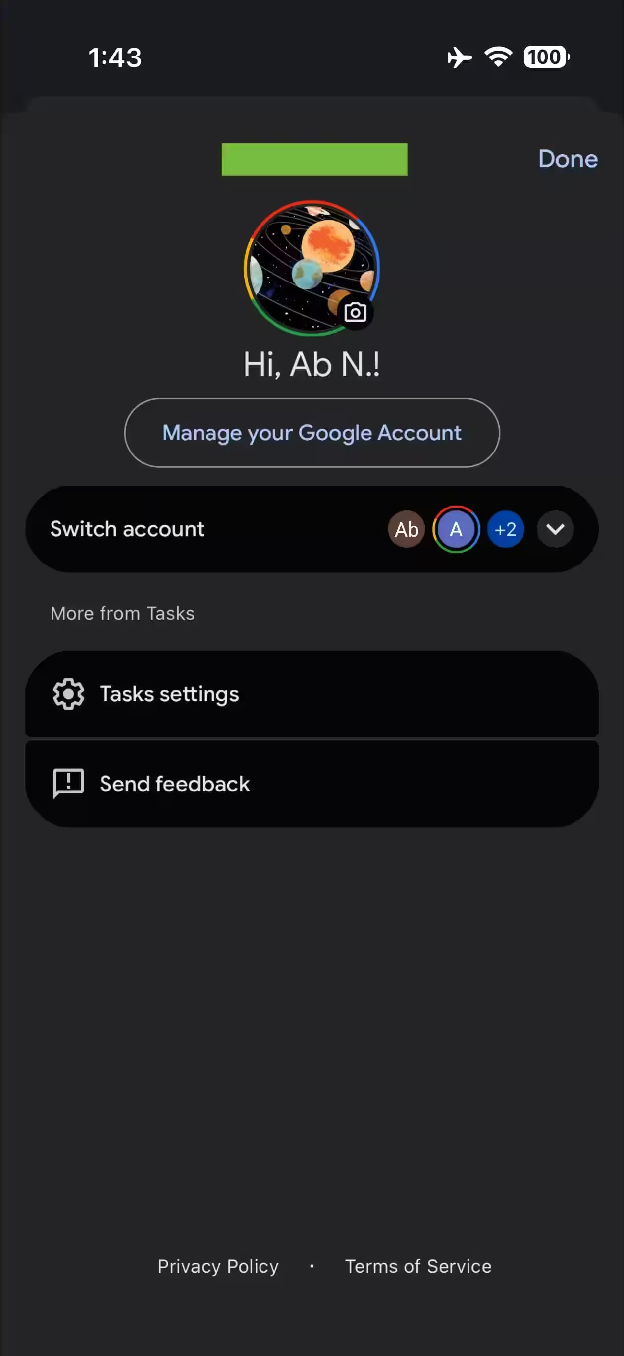
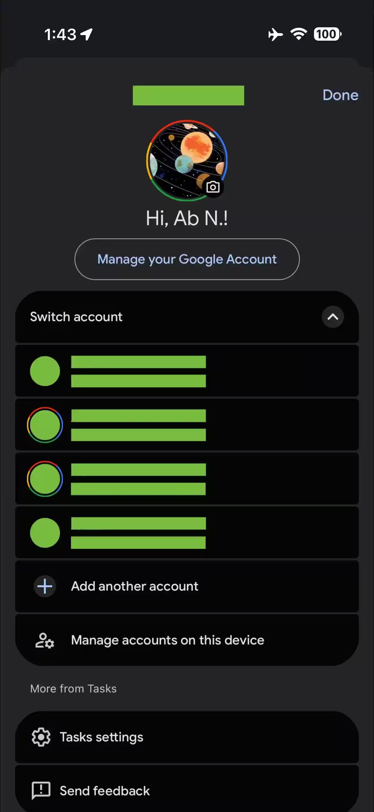
Most Google apps on iOS have gotten a revamped account menu and profile switcher, similar to the Android version. Previously, tapping on an avatar in the top right corner opened a pop-up window with a list of all the accounts on your device. This format kept the main app screen visible. Now Google has changed its approach: the account menu appears as a panel that pops out from the bottom of the screen. Avatar menu is now available as a pop-up window that appears at the bottom of the screen. The top of the panel displays your Gmail address and a greeting «Hi, [name]!», next to —a large, round avatar and an enlarged button «Manage your Google Account». Below that is a drop-down list «Switch account» with items «Add another account» and «Manage accounts on this device». Each element is styled in Material 3 Expressive. Next up is a block «More from [app]» that collects additional features of a particular app, such as settings. When you scroll down, an avatar «docked» next to your email address. The iPad uses a pop-up window rather than a full-screen bar. The new interface looks more modern and noticeable, but full-screen mode loses context — you can no longer see the app’s background. Still, the design is the same as what’s used in the web version of Google’s services. Users can still swipe up or down on the avatar to quickly switch accounts without leaving the home screen. The updated menu appears in most of Google’s iOS apps, including Gemini, Google Home, Photos and Translate. Google Workspace products — Docs, Drive, Gmail, Keep, Meet, Sheets, Slides, and Tasks — have not yet rolled out the changes.
New Google Account interface on iOS
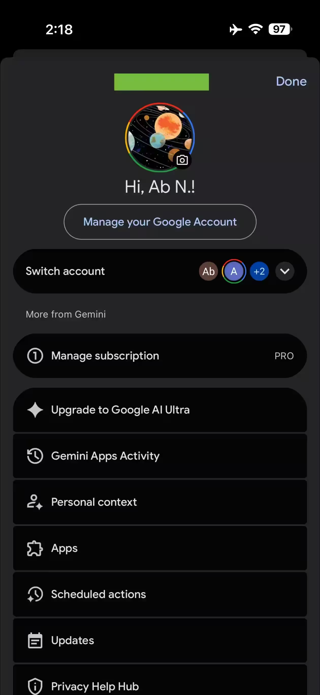
Convenient, but with a loss of context
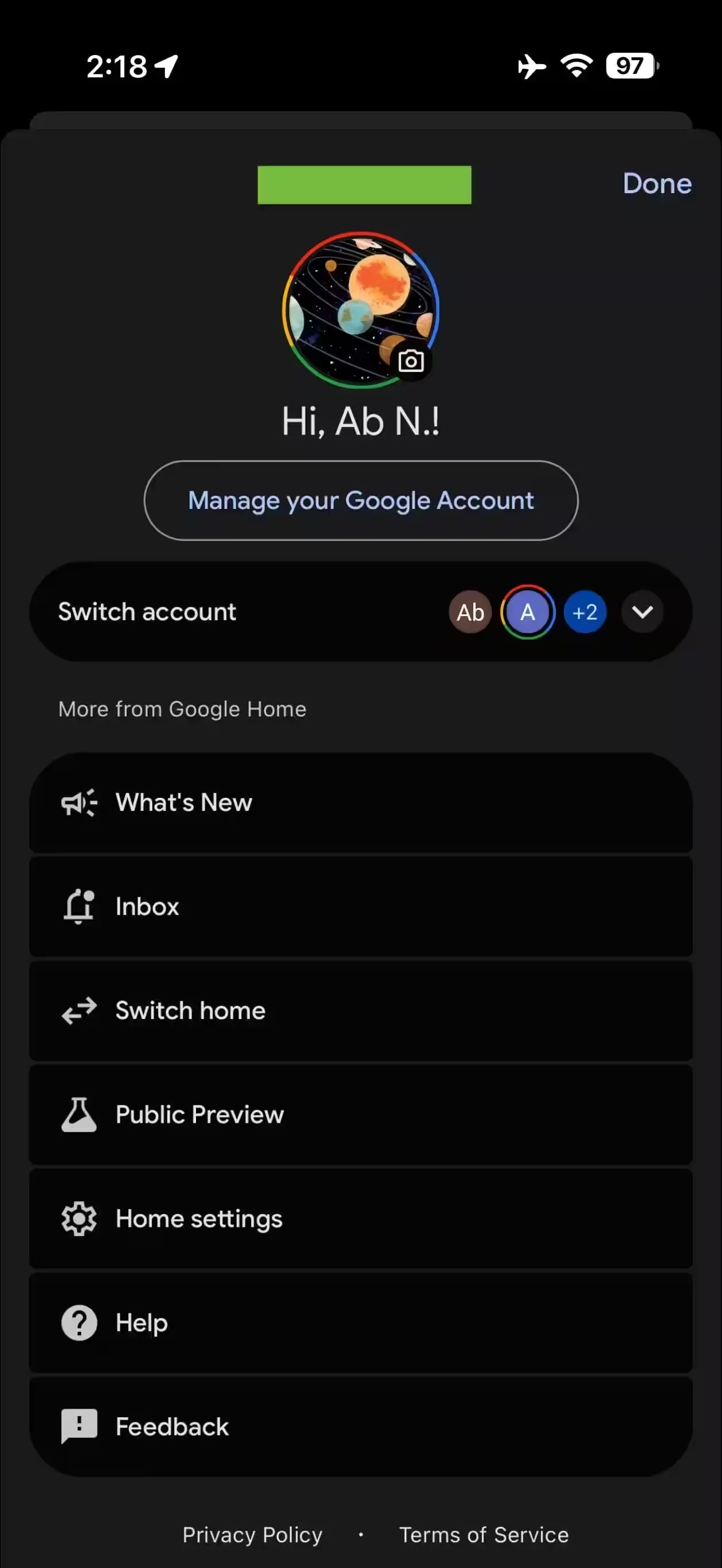
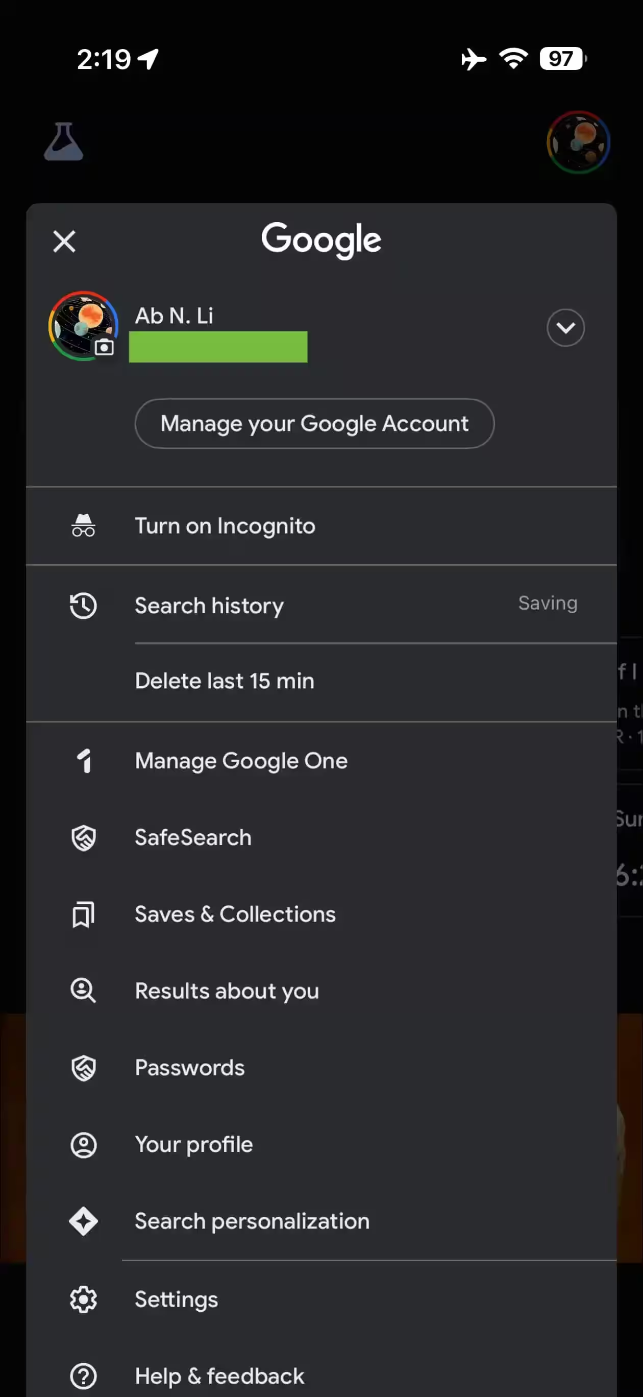
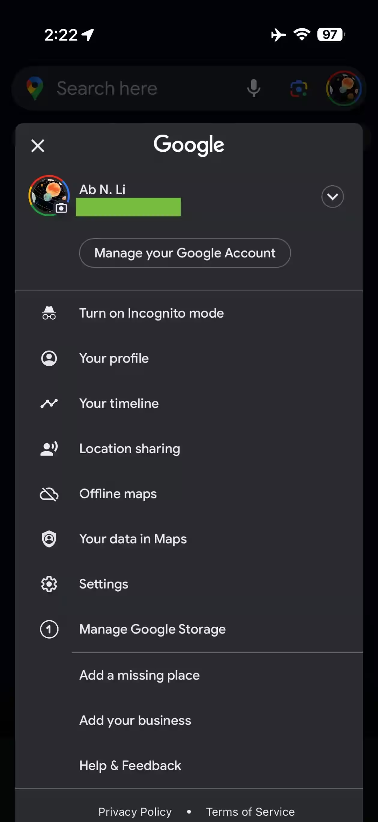
Where the update is already available


