“Yandex Maps” became more accessible for visually impaired users

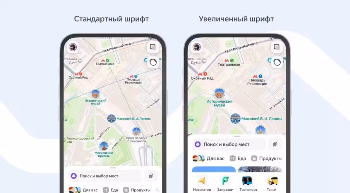
In the process of creating a new version of the Yandex.Maps application, the company’s specialists analyzed the user experience of people with visual impairments. The majority of respondents noted that a larger font significantly facilitates navigation in the urban environment. The data obtained will be used by the developers for further optimization of the application. The new version of the application “Yandex.Maps” will be used by the developers for further optimization of the application. Now, if your device has a larger text size set in its system settings, interface elements and map text will also be automatically scaled. To change the font and icon size, check your phone’s screen settings. On iOS, you can do this in the “Universal Access” section, and on Android devices in the display settings. Maps automatically adapts to the selected settings, increasing the size of place names and other text elements. There are now three zoom options available to users: slightly larger, medium, and maximum. Even with a significant increase in font size, the map remains easy to read. The placement of lettering and names is optimized to avoid overlap. This ensures that Maps remains clear and provides a comfortable perception of information. In addition, the developers announced plans to introduce a larger font in the navigation mode in future updates of the app.