The Mail.ru mobile app has been revamped with a fresh design that features a navigation menu now anchored at the bottom of the screen, along with a new “Services” section that brings together the superapp’s additional features.
Key updates include:
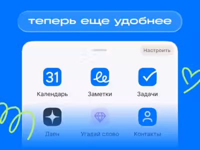
The core navigation panel now houses Mail, Shopping, Cloud, and a button that opens all Mail services. This layout makes jumping between different projects faster and smoother. Users have the freedom to tailor the main menu-adding services or rearranging them according to their preferences.
With folder titles and the search bar positioned higher, the email list workspace expands, giving the interface a cleaner, more streamlined feel. All essential services are conveniently grouped on one screen, simplifying navigation throughout the superapp.
“We pay close attention to user feedback and consistently test our changes through research. The updated navigation was rated as more user-friendly and appealing by most participants. Users noted it helps them complete tasks faster within the app. This kind of feedback drives us to make our services simpler, clearer, and more convenient for daily use,” said Mail’s product director Sergey Prokudin.
If users want to switch back to the previous navigation style, they can do so by going to “Settings,” then “Appearance,” and tapping the relevant button. The option to revert to the old interface remains available for those who prefer the original layout.
