Google has updated its “G” logo for the first time in nearly 10 years

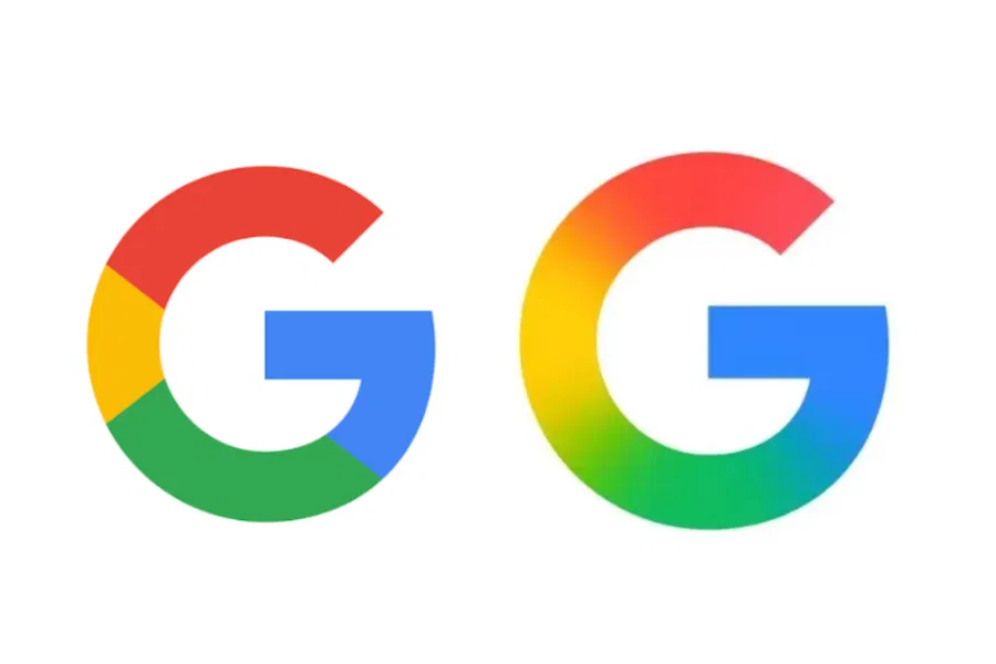
Google has changed its recognizable “G” logo, making it more modern – for the first time since 2015.
The company has rolled out an updated version of the logo in Google’s iOS app. Instead of the usual crisp borders between colors, it now uses a smooth gradient of the company’s signature shades of blue, red, yellow, and green. This was first reported by 9to5Google.
The last major redesign of Google’s logo happened in September 2015. Back then, the company switched to a sans serif font and introduced the current “G” emblem with four colors. But now the style is closer to what’s already used in the design of the Gemini logo, Google’s AI assistant.
For now, the new design only appears in the iOS version of the app. In the Android and web versions, the logo remains the same – with distinctly separated colors. There’s no comment from Google itself.
The move could signal the beginning of a broader refresh of the company’s corporate identity. Stay tuned – it’s likely that the changes will soon make their way to other platforms as well.
The Google updates its “G” logo for the first time in nearly 10 years was first published on ITZine.ru.


