itzine updated the logo and refreshed the website: minimalism, speed and a new rhythm
We’re changing. And we’re not doing it because we have to, but because we’re growing up with you. Today itzine.ru is released in an updated form – with a new logo, identity and a slightly rethought design. All for one goal: to make it easier, clearer and more interesting for you to read about technology, gadgets, science, space and the future.
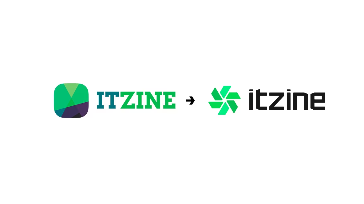
New logo: assembly point
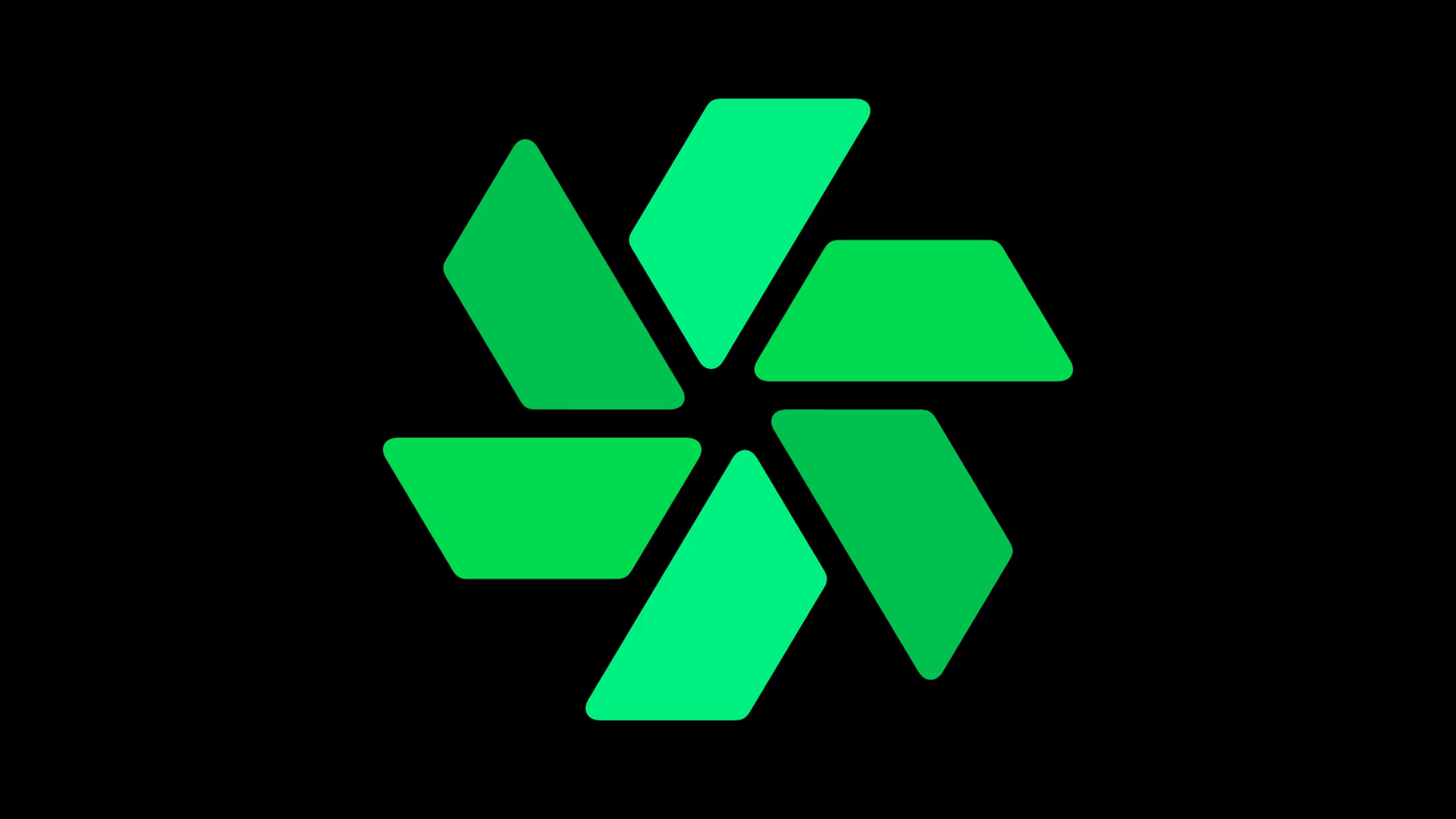
The itzine symbol now looks different. Instead of the previous composition of transparent shapes, the new sign is made up of six outward-facing smartphones or tablets, you decide for yourself. They form a dynamic symmetry, as if it were an eternally rotating device – something between a fan, a boot icon, an allusion to ChatGPT and Google Photos. Yet the logo remains light, recognizable, and technologically advanced.

The color palette is a clear gradient from green to mint. We chose these colors for a reason: green represents energy, development, ecosystem. Mint is freshness and lightness. Together they speak of our rhythm – lively, attentive and modern. But in most cases, you’ll see an even simpler monochrome (black or white) logo to keep your attention on the content.
The logo comes in different versions: color, monochrome, square for avatars, elongated for hats and favicons. All adapted for screens, platforms and formats.


Font: engineering minimalism
The name itzine is now written in a new font – monospaced, angular, sans serif. It’s as if it came off a terminal screen or dev console. It’s our reference to people who value precision, logic, structure – from developers and engineers to those who just like clarity. And yes, we’ve moved away from capitalization, it’s less obtrusive now.

The text has become stricter, but not colder. It’s not clerical, but concentrated.
Site updates
With the logo, we’ve done a little revision of the site design. No revolution, just evolution:
- cleaned the interface from unnecessary;
- updated the color accents;
- improved readability on mobile;
- accelerated loading;
- made more air and rhythm between elements;
The homepage is now easier to understand, the navigation is clearer, and the content reaches the eye faster. That’s what we’ve always wanted: to accompany rather than distract.
Why we did it
We started out as an experiment and a hobby. Within a couple years, we grew into a media outlet of some sort. We have columns, digests, columns, podcasts, partner special projects. We are quoted, commented on, discussed. We’ve become more visible, which means it was time to clean up our image.
This redesign is not about trends. It’s about identity. We don’t aspire to be like anyone else. We want to be ourselves. And we want every element – from the favicon to the logo on the T-shirt – to have our voice.
Thank you for being with us. Stay in touch.Subscribe, read, share.
We’ve become a little different. But it’s still about what moves the world.
The itzine logo and website refresh: minimalism, speed and a new rhythm was first published at itzine.ru.

